Writers labor to make the visual world visible in fiction. There are many ways to do it. Here’s how William Makepeace Thackeray, age 33, made us see the world, in an incidental moment in Barry Lyndon:
On Sunday, no sooner was my mother gone to church, than I summoned
Phil the valet, and insisted upon his producing my best suit, in
which I arrayed myself (although I found that I had shot up so in my
illness that the old dress was wofully too small for me), and, with
my notable copy of verses in my hand, ran down towards Castle Brady,
bent upon beholding my beauty. The air was so fresh and bright, and
the birds sang so loud amidst the green trees, that I felt more
elated than I had been for months before, and sprang down the avenue
(my uncle had cut down every stick of the trees, by the way) as
brisk as a young fawn. My heart began to thump as I mounted the
grass-grown steps of the terrace, and passed in by the rickety hall-door. The master and mistress were at church, Mr. Screw the butler
told me (after giving a start back at seeing my altered appearance,
and gaunt lean figure), and so were six of the young ladies.
There are many obvious, and utterly unremarkable, visual touches: “the green trees”; “the rickety hall-door”; “grass-grown steps”; “gaunt lean figure”. None of these four is memorable writing, that is to say not one of them seems like a piece of invention that sets in one’s mind a way of writing about trees, or doors or a figure that we haven’t seen before (while, perhaps, “grass-grown steps” approaches the memorable with those atoms of alliteration colliding within three short syllables). Not memorable, in the main, but visible and, perhaps, one could argue, more visible than writing that might belabor description to the end of creating something verbally memorable— and here one thinks of a description, by a contemporary writer that gives us a pictures of, well, see for yourself:
He is walking from her dormitory; it is the first time they have slipped their hands into each other’s pants. He is walking through the town square, a meticulously planted conglomerate of trees, lawns, and flowerbeds, which the Midwestern college maintains to remind itself of its less progressive Eastern brethren. It is morning. The clouds extend practically to the top of the leafless oaks and a light drizzle sweeps in out of nowhere as if to remind the pedestrian of what clouds are all about. And yet, in one of the vagaries of Midwestern weather, this overcast February morning suddenly achieves an unlikely springlike temperature, conveyed through a wind as warm as the gust of a hair dryer.
Memorable, that description of unlikely February wind, “wind as warm as the gust of a hair dryer.” But as writing goes that’s just a lot of hot air: it shows us nothing so much as a man writing. Naturally, some will find the writing above beautiful because you can see the writer exerting himself so strenuously, so conspicuously. Philosophically, I prefer writing that shows its effects more discreetly, that exerts itself more, to my mind, purposefully– to the purpose of allowing the reader to be complicit in the process of imagining the seen. An inevitability, you’ll say, such complicity: we will all imagine different hair dryers … when envisioning this writer’s unlikely wind. My ultimate feeling about such hot-air writing is that it illustrates a scene too conspicuously, rendering it less– not more– visible.
As such, you might imagine that I’m not a big fan of illustrated editions of books for adults. You know the ones: Dos Passos’s USA, illustrated by Reginald Marsh, say, seems like a desecration: all those literal scribbles (made at the request of Dos Passos, himself an illustrator) of novelistic moments that need no amplification. Precisely one of the great pleasures of fiction reading is the way words, well-ordered, achieve their own local power while, as well, sparking the distant tinder in a reader’s head, that warehouse of images we all log from a life of looking.
But, just as there are some more gongoristical writers of prose who manage, nonetheless, to achieve an effect in their writing that trumps any bias I may bring to reading, there are also examples of illustrated books that trump my dislike of the idea. The latest in this category has, so far, nothing to do with the books and everything to do with their illustrator, the painter Lucian Freud.
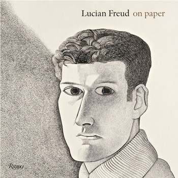
Rizzoli has just put out Lucian Freud on Paper which, in addition to its expected hoard of marvels by the great British artist contains, for me at least, unexpected news: In his twenties especially, Freud contributed illustrations to a number of book covers as well as to one book of poems (The Glass Tower by Nicholas Moore) and one novella (The Equilibriad by William Sansom). I’m not at liberty to display any of these images here, but there is one image from the Sansom available to view on the web, here, in a miserably small and unrevealing resolution. What makes these illustrations unusual in the history of illustrated books is that the books have been greatly eclipsed by their illustrator. At the very least, they suggest that for an illustrated book to serve more than a merely decorative function the author and the illustrator must be doing equal work, contributing materially to the success of the whole.

